How do you convince visitors to your site to take the plunge and convert to becoming a customer? A good landing page is one of the most effective ways of converting visitors into leads.
Let’s say you have a special offer of a free ebook. Through it, you highlight your expertise and demonstrate how to solve a business problem. Your goal is to get visitors to download your free offer in exchange for giving you their contact information. In short, you want to generate leads.
The question becomes: how do you get that offer into people’s hands?
Instead of directing visitors to your home page, where they may get lost with too many choices, you get them to a landing page.
It should be simple and uncluttered. It has one purpose: to convince visitors to opt into your offer.
Landing pages, also called lead capture pages, are essential to capture sales leads. And they’re not hard to create. You just need to be clear on the purpose, and find the right tools to help you create and test one.
Example Page
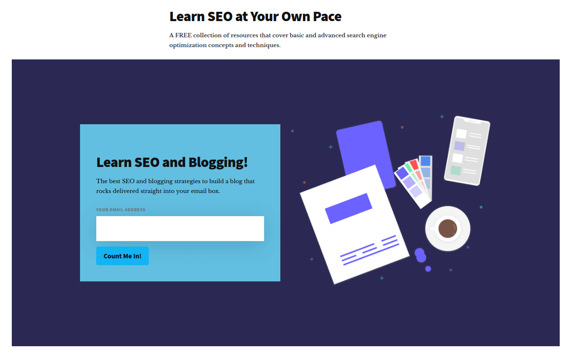
Here’s a landing page created by one of our BizSugar Mastermind Community members for our Landing Page Challenge.
This is from Erik Emanuelli’s free collection of resources for learning SEO.
Elements of a Good Landing Page
To ensure your landing page does what it is supposed to do — convert — it needs to look good.
Beyond looking professional and pleasing, your landing page propels visitors to take action.
An optimized landing page should include the following elements:
- Catchy, relevant headline. Get the person’s attention and instantly communicate the benefit.
- Compelling description of the offer. Focus on the value the recipient will get. Limit verbiage to a short paragraph and/or 3 to 5 short bullets.
- An image. Use a small ebook cover, video thumbnail or other image depicting the item.
- Form for the user to enter contact information. Depending on the design, the text input fields may only appear once you click a button, in a popup box. Or they may appear on the landing page itself.
- Call-to-action button. Make it obvious what you want the user to click. The button should be prominent. Bright colors (orange, red, bright green, etc.) work well for buttons.
Include a brief statement of your privacy policy (“We will never sell your information” type of statement). Also, GDPR compliance may apply.
Minimal Data Fields are Best
Limit the number of data fields you collect. The more you ask for, the fewer completions you’ll get. Email address and perhaps name are the only essential fields. Everything else (company name, title, industry, etc.) only helps qualify leads to see how promising they are.
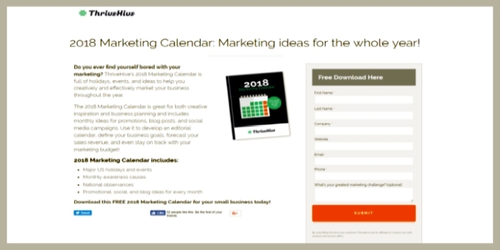
The screenshot below shows a landing page requesting seven fields. However, only five of them are mandatory. All of the mandatory ones are easy to fill out. First name, last name, company, email and phone number.
Also, this provider probably has tested the landing page and feels this is the right mix. Do your own testing. See at what point people drop off and stop filling out the form. A testing tool like PageSense can easily test this and other elements.

How to Design an Effective Landing Page
Page design is part art, part science. Landing pages should look pleasing. They must be uncluttered. They must also do a good job of “converting” people to request your lead magnet.
Many business people today use landing page builders. These are software tools that offer pre-tested templates. They make it easy because everything is set up for you. The essential elements are included in the template. You just have to customize it.
The tool can even publish and host the page. This means, if you don’t have tech support to help load new pages to your website, you can still get going immediately with that ebook lead magnet.
Builders and Tools
Leadpages.net is one tool we’ve had good success with. Instapages and Unbounce are two other tools.
If you use WordPress, landing page plugins like OptimizePress or Thrive Architect are worth exploring.
I can’t emphasize enough how important it is to use a landing page builder tool. You will learn best practices along the way. Let the tool teach you — by using it.
You’ll also end up with a better result in less time. Chances are it would take many hours of trial and error to learn how to design an effective page on your own.
The above image is a pretty good landing page example. See the following for live examples of landing pages: here, here, and here.
One last point: Resist the temptation to overdo it. First timers often clutter landing pages. They add too many words. Or they add videos and other distractions. The newbie thinks, “The more content, the better to convince people.”
But that’s a mistake. Readers get overwhelmed. If they see something too lengthy, it’s easier to hit the back button and leave. Empty space is your friend on a landing page.
Recap: Steps to Create Your Landing Page
1. Choose a landing page builder. Use a landing page builder tool. You’ll save time and get a professional result.
2. Create content for your page. Keep it concise. Make a compelling case in a few sentences or bullets. Use a visual item such as a thumbnail image and a bright button.
3. Test, test, test. Use a testing tool like PageSense to test your landing pages. Make tweaks to improve conversion rates.
Finally, consider the entire process and how the page fits in. See: How to Set Up a Lead Magnet to Collect Leads.
Image: Shutterstock / Screenshot


Helpful stuff.
Great infomation here, thanks for the professional approach and advice.
Hi Helen,
We do hope you’ll join our Mastermind Community if you’re interested in more discussions on landing pages and conversion optimization.